Choosing Transport Art for Vintage Home Interiors
Well-chosen transport art gives vintage home interiors a sense of place, not just a sense of age. A scenic motoring poster can connect a walnut sideboard, an inherited armchair and memories of a favorite journey without turning the room into a vehicle-themed display.
The strongest choice is rarely the oldest-looking print. It is the artwork whose subject, composition and colors belong with the furnishings you already enjoy. Start with the room’s character, then choose a transport story that adds something personal. A German road-travel scene offers a useful example: automotive interest, architectural detail and landscape in one image.
Separate genuine vintage from vintage-inspired art
An original vintage poster, a modern reproduction of a historical design and a newly created retro illustration are different purchases. All can suit an older interior, but they should not be described interchangeably.
An original carries a physical history. Its printing process, paper, provenance and condition matter to its collectible value. A reproduction brings an existing design into a new print, while retro-inspired artwork borrows visual cues from an earlier period without necessarily reproducing a historical work.
For decorating, you do not need every object to be old. A newly printed poster can sit comfortably above an antique chest when its palette and visual weight make sense there. Equally, distressed paper effects do not automatically make an image appropriate for a period room.
Choose the image for its relationship with your home, then assess the object you are buying. Check whether the listing identifies a historical source, what format is supplied and whether framing is included. Do not assume a vintage subject means an original vintage sheet.
Choose art for vintage home interiors by mood
Before choosing a vehicle, decide what the room should feel like. A quiet reading room might benefit from a landscape-led travel image. A sociable living room can accommodate stronger lettering or a busier street scene. A study may suit the closer inspection encouraged by mechanical detail.
Look beyond the dominant color. Notice how much open space surrounds the subject, whether the lettering attracts attention first and how the image directs your eye. A road disappearing toward mountains creates a different atmosphere from a car isolated against a plain background.
Use the furnishings as a starting point:
| Existing room character | Transport-art direction to consider | Styling approach |
|---|---|---|
| Dark wood, patterned upholstery and collected objects | A scenic travel composition | Give the image a plain mat and space around it |
| Streamlined furniture and restrained accessories | A graphic vehicle illustration | Repeat one frame finish and limit competing patterns |
| Painted furniture, woven textures and soft fabrics | A landscape-led motoring or rail scene | Keep surrounding colors quiet and let the scenery lead |
These are starting points rather than period rules. The aim is a convincing relationship between objects, not a historically exact room set.
The appeal of a scenic motoring poster
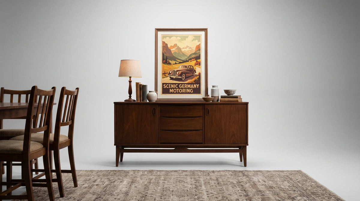
Transit Art’s Motoring in Germany: Scenic Road Adventures places a vintage car in the foreground of a landscape featuring mountain peaks, historic churches and castle ruins. Its interest extends beyond the vehicle: the architecture and scenery give viewers several ways into the image.
That balance makes scenic motoring artwork useful in vintage home interiors shared by enthusiasts and people whose interests lie elsewhere. One person may notice the car first; another may respond to the landscape or the promise of a road trip.
Travel posters have long presented destinations as experiences rather than simply locations. The Library of Congress Travel Posters collection provides historical examples of how scenery, transport and graphic design were brought together to encourage travel. A scenic motoring composition belongs naturally within that broader visual tradition.
There is no need to assign an unverified make or model to the car to appreciate this particular print. Its appeal rests on the relationship between machine and landscape: the vehicle suggests movement, while the buildings and mountains provide a destination worth imagining.
For a road-trip enthusiast, it can recall the pleasure of taking the scenic route. For someone drawn to travel illustration, the layered landscape may be the main attraction. That flexibility helps automotive art feel at home outside a dedicated garage or hobby room.
Interior design: make the artwork belong to the room
Choose the wall before choosing the size
Assess the intended wall from the places where you actually spend time. Above a sideboard, the print needs to relate to the furniture beneath it. Beside an armchair, a smaller piece can reward close viewing. Over a sofa, a detailed landscape may lose its impact if it is too small to read across the room.
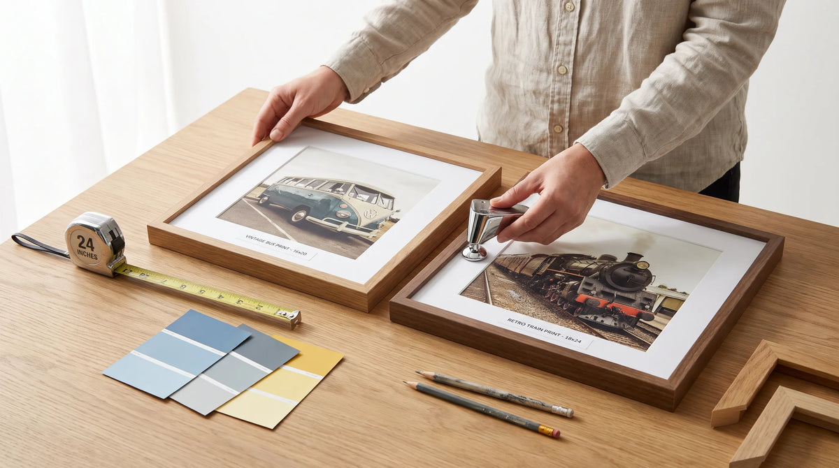
For vintage home interiors, the framed dimensions matter more than the paper dimensions alone. A substantial mat and frame can turn a modest print into a much larger wall object. Mark the full outside dimensions with paper or removable tape before ordering.
Do not automatically center artwork on the entire wall. Centering it over the furniture grouping often creates a more settled arrangement, especially when a doorway or tall cabinet makes the architecture uneven.
For a tight passage, Transit Art’s guide to choosing art pictures for a narrow hallway explores the separate questions of viewing distance, framed depth and sightlines.
Use framing to connect old and new
A frame is the transition between the print and the room. Dark wood can relate to an existing cabinet without matching it exactly. A simple black frame can give a colorful travel image a clear boundary. Neither needs artificial wear to work beside older furniture.
Choose the mat against the actual print rather than assuming every vintage-style image needs cream. A warm off-white may complement some paper tones, while an overly yellow mat can make others look dull. Compare samples in the room’s daylight and evening light.
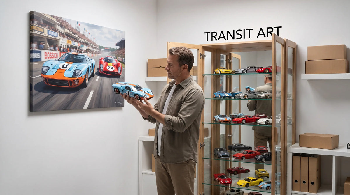
Keep the nearby styling restrained. If the image contains a car, churches, mountains and ruins, it already supplies plenty of detail. A lamp and one well-chosen ceramic object may be enough on the furniture beneath it. Avoid surrounding every transport print with model vehicles unless that is deliberately the focus of the room.

Recommended Poster Pairings
Use the Germany motoring print as the starting point, then select a companion with a clear job to do. Transit Art’s vintage and retro poster collection is a useful place to compare potential partners. Judge the actual images together rather than assuming that two vintage subjects will automatically coordinate.
Scenic motoring with a railway poster
Look for a railway print that shares either the landscape emphasis or one noticeable color with the Germany scene. If both images contain detailed scenery, choose similar outer frame dimensions to give the arrangement some order.
This pairing connects two ways of experiencing a journey without repeating the same subject. It suits a living room or hallway where travel is a shared interest, rather than only one person’s automotive hobby.
Let one image lead. A larger motoring print with a smaller railway companion can feel more collected than two equally assertive posters competing for attention.
Scenic motoring with a classic-car poster
For a more automotive arrangement, choose a second print that concentrates on a vehicle rather than another expansive landscape. The difference in composition creates variety while the subject matter supplies a connection.
In vintage home interiors, this pairing works particularly well in a study or reading corner where the artwork can be examined at close range. Match one element, such as the mat color or frame profile, rather than trying to match every color in both prints.
Avoid selecting the companion solely because its car comes from a similar era. A quieter vehicle image may be a better visual partner than a historically related but much busier racing composition.
Check materials and display conditions
A pleasing image still needs a suitable physical presentation. Transit Art lists FSC-certified paper and gallery-quality poster finishes among its print offerings. Check the individual product page for the available format, dimensions and supplied finish before choosing a frame.
FSC certification concerns responsible sourcing; it is not, by itself, a guarantee of resistance to fading. Treat those as separate considerations when comparing print and framing specifications.
Keep paper artwork away from direct sunlight, damp walls and cooking splashes. If glazing is used, ask the framer about UV-filtering options and how the print will be held away from the glazing surface. Protection reduces exposure risks but does not make a sunny wall harmless.
Finally, inspect the arrangement in evening light. Reflections can obscure a detailed landscape even when the placement looks excellent during the day. Moving a lamp or adjusting the artwork’s position may solve the problem without changing the frame.
Frequently asked questions
Can modern prints work in vintage home interiors? Yes. A modern print can complement older furniture through its subject, palette and framing. It does not need to imitate the wear of an antique, and it should not be mistaken for an original historical poster.
Should transport art match the age of the furniture? Not necessarily. A shared mood, compatible colors and balanced proportions usually matter more than matching dates. Period consistency is useful when creating a deliberate historical scheme, but it is not essential for a collected home.
How many transport posters should hang together? Start with one strong print or a pair. Add another only if it contributes something distinct, such as a different composition or another part of a travel story. Available wall space and visual complexity matter more than a fixed number.
Is scenic motoring art suitable for a living room? Yes. A landscape-led composition offers scenery and architectural interest alongside the car, making it easier to integrate into a shared room than a narrowly technical vehicle image.
Start with a journey you would enjoy looking at
Choose transport art that holds your interest after the first glance. The Germany motoring poster offers a car to study, a landscape to explore and architecture that rewards a closer look. Give it a considered frame and enough room to be seen before adding companions.
A successful arrangement does not need many pieces. One well-placed print can connect a love of travel with the furniture, colors and objects that already make a home feel personal.