How Framed Prints Create a Cohesive Gallery Wall
Framed prints are one of the most reliable ways to turn separate artworks into a gallery wall that feels deliberate rather than accidental. A frame gives every poster a visual boundary, which helps different subjects, colors and eras sit together with confidence. That is especially useful for transport-inspired art, where a steam locomotive, a racing car and a modern vehicle silhouette can all share the same wall when the composition is planned well.
A cohesive gallery wall does not need identical artwork. In fact, the strongest walls often combine contrast: old and new, motion and stillness, engineering detail and graphic simplicity. The unifying element is usually not the subject alone. It is the rhythm of the frames, the balance of color, the spacing between pieces and the story you want the room to tell.
Why framed prints make gallery walls feel intentional
A bare poster can look relaxed and casual, which works beautifully in some spaces. A framed poster, however, changes the visual language. It adds structure, protects the print and makes the artwork feel integrated with the room rather than simply placed on the wall.
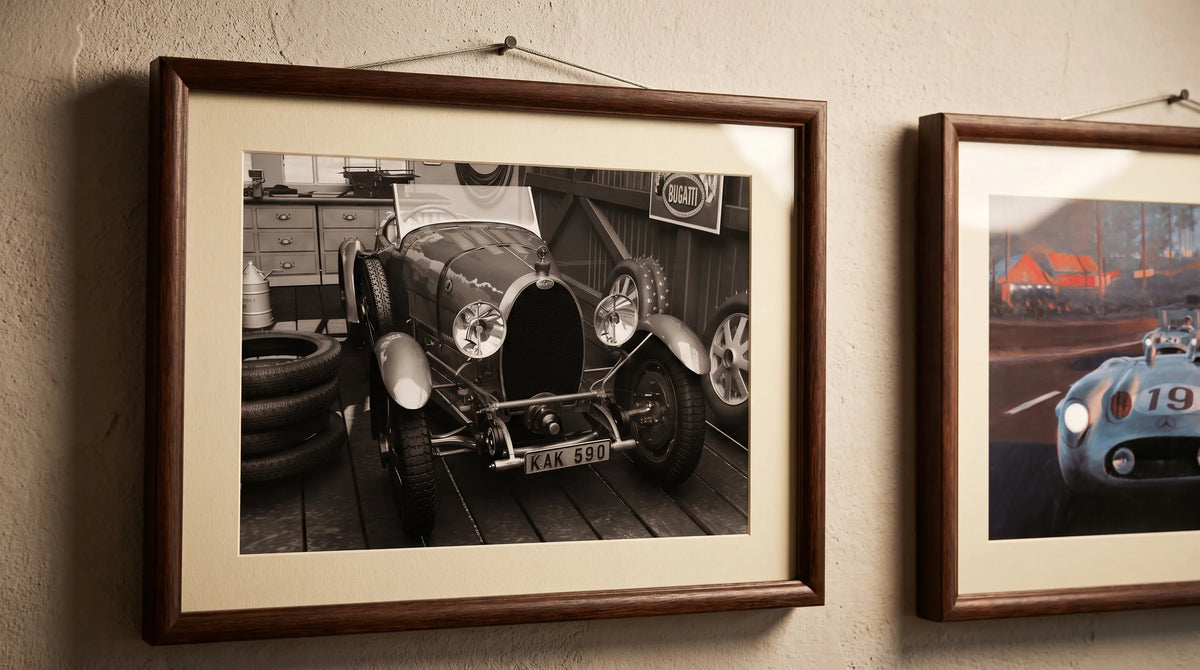
Frames also help bridge different design styles. A vintage railway print can sit comfortably beside an Art Deco racing poster if both are presented with similar frame finishes or mat proportions. The frame becomes the common thread, while the artwork provides personality.
For transport enthusiasts, this matters because vehicle art often carries strong identity. A train poster might suggest heritage and travel, while a racing poster brings speed and drama. With framed prints, those different moods can become part of one collected visual narrative instead of competing for attention.
Start with a story, not just a layout
Before measuring the wall, decide what the gallery is about. A good gallery wall has a point of view. It might celebrate European travel, historic engineering, motorsport glamour or the romance of movement itself.
Transit-inspired art works especially well because vehicles are never just objects. They carry memories of places, journeys and eras. A railway poster can evoke the optimism of early mass travel. A racing poster can recall the elegance of prewar motorsport and the graphic confidence of 1930s design.
This storytelling approach also prevents the wall from becoming a random grid. Instead of asking, “Does this fit the gap?”, ask, “Does this add to the story?” That small shift makes the final arrangement feel much more curated.
Two historic posters that anchor a transit gallery wall
A cohesive wall often needs one or two anchor pieces. These are the prints that define the mood, scale and palette for everything around them. The following two Transit Art pieces work well together because both connect movement, history and strong graphic design, while still offering different visual energies.
The railway heritage anchor
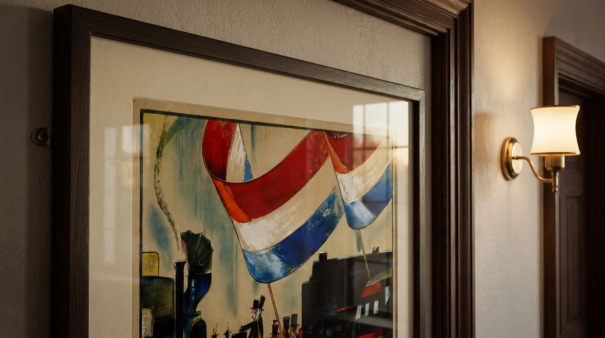
The 100 Years of Dutch Railways Poster has the character of a commemorative travel print. It marks the centenary of Dutch railways, a milestone connected to the Netherlands' first passenger railway between Amsterdam and Haarlem in 1839. The artwork features a historic procession with red, white and blue flags, along with a steam locomotive that represents the early age of rail travel.
As a gallery wall element, it brings ceremony and nostalgia. The flags add color without overwhelming the composition, while the locomotive gives the piece a strong historical subject. Train enthusiasts will appreciate the reference to railway heritage, but the poster also works for interiors because its vintage styling feels warm, decorative and easy to pair with wood, linen, leather and soft neutral walls.
The racing energy anchor
The 1939 Roma Circuito dell'Impero Racing Poster brings a different kind of motion. The streamlined blue number 66 sports car sweeps past the Colosseum, combining motorsport with one of Rome's most recognizable landmarks. Its Art Deco influence shows in the bold lettering, flowing motion lines and elegant sense of speed.
This print is ideal when you want a gallery wall to feel more dynamic. The cool blue tones can balance warmer vintage pieces, while the Colosseum adds architectural weight. For car enthusiasts, the appeal is clear: it captures racing as culture, design and spectacle, not only as competition.
How to choose frames, colors and spacing
The fastest way to make a gallery wall look unified is to limit the number of frame styles. You do not have to use the same frame for every piece, but repetition helps the eye connect them. Black, walnut, oak and slim metal frames all work well with transit art, depending on the mood of the room.
A simple rule is to let the artwork provide variety and let the frames provide order. If your posters include multiple colors, choose frames in one finish. If your artwork is mostly monochrome, you can introduce two frame finishes, such as black and natural oak, to add warmth.
| Design choice | Best approach | Why it works |
|---|---|---|
| Frame finish | Repeat one finish across most pieces | Creates visual consistency |
| Mat board | Use similar mat widths for varied poster sizes | Makes different formats feel related |
| Spacing | Keep gaps consistent, usually 2 to 4 inches | Gives the wall a calm rhythm |
| Color palette | Pick 2 or 3 recurring colors from the art | Connects different subjects naturally |
| Anchor piece | Place the strongest print near the center or at eye level | Gives the arrangement a clear focal point |
With framed prints, the negative space around each image matters almost as much as the image itself. A mat board can make a smaller poster feel more substantial, while a narrow frame can keep a bold design from feeling heavy.
Interior design inspiration for different rooms
A gallery wall should respond to the room it lives in. The same posters can feel refined in a living room, focused in a home office or playful in a hallway, depending on scale and placement.
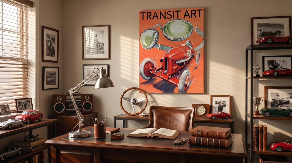
In a living room, place the largest print above a sofa or sideboard, then build outward with smaller works. The wall should feel connected to the furniture below it, so avoid hanging everything too high. In a home office, a tighter arrangement above a desk can create a personal backdrop that reflects your interests without cluttering the workspace.
A hallway is perfect for narrative art because people encounter it while moving through the home. Transit posters feel natural there, since the subject already suggests journeys and routes. A series of railway, racing or aviation prints can make a corridor feel like a small private exhibition.
For modern Scandinavian interiors, choose light oak frames, generous white mats and a restrained color palette. For industrial interiors, black frames and bolder contrasts feel at home. For a classic study or reading corner, darker wood frames can bring depth and warmth.

Recommended Poster Pairings
The strongest pairings have both contrast and connection. The Dutch railway poster and the Roma racing poster are not identical in subject, but they share a love of movement, historic transport and graphic drama. Together, they can create a compact gallery wall that appeals to both train enthusiasts and automotive design fans.
100 Years of Dutch Railways Poster
Use this as the heritage piece in the arrangement. Its commemorative character, steam locomotive subject and red, white and blue flag details make it a strong choice for a living room, hallway or reading nook. It pairs well with natural wood frames, cream mats and interiors that use warm neutrals.
1939 Roma Circuito dell'Impero Racing Poster
Use this as the motion piece. The blue sports car and Colosseum setting bring energy, architecture and color contrast. It works beautifully in a home office, studio or media room, especially when framed in black or dark walnut to emphasize the Art Deco mood.
When you use framed prints with different subjects, hang them at the same baseline or centerline. That single decision can make two separate posters feel like a designed pair. If you add more pieces later, repeat one color from each anchor, such as blue from the racing poster or red from the railway flags.
Building the gallery wall step by step
Once you have selected your main posters, plan the wall before making holes. Place the framed pieces on the floor and test a few arrangements. You can also trace each frame on paper, tape the templates to the wall and adjust the spacing until the layout feels balanced.
For a two-piece arrangement, symmetry works well. Hang the posters side by side with equal spacing and align their centers. This gives the pairing a formal, gallery-like feel. For three or more pieces, use one anchor print and let the others step around it in a looser composition.
A few practical guidelines keep the result polished:
- Keep the center of the arrangement close to eye level, often around 57 to 60 inches from the floor.
- Match the width of the gallery wall to the furniture below it, usually about two-thirds of the furniture width.
- Leave breathing room around bold posters so the colors and lettering remain easy to read.
- Use consistent spacing between frames to create a calm visual rhythm.
Quality also matters. Transit Art prints are made with gallery-quality materials and FSC-certified paper, which gives the artwork a more refined presence when framed. A good print, a considered frame and careful placement work together to make the wall feel permanent rather than improvised.
Common gallery wall mistakes to avoid
The most common mistake is treating every piece as equally loud. If all posters are bold, large and high contrast, the wall can feel restless. Give one or two works the leading role and let supporting pieces be quieter.
Another mistake is mixing too many frame finishes. Variety can be beautiful, but too many finishes make the wall feel fragmented. If you want contrast, limit it to two finishes and repeat each one at least twice.
Scale is also easy to misjudge. Small prints can disappear on a large wall unless they are grouped closely or framed with generous mats. Large prints need enough room around them to breathe. This is where framed prints help, because the frame and mat can adjust the visual weight of each piece without changing the artwork itself.
Frequently Asked Questions
How many framed prints do I need for a gallery wall? A small gallery wall can work with two or three pieces, especially above a console table or desk. Larger living room walls often need five to seven pieces, but the right number depends on the wall size, frame scale and amount of negative space.
Should all frames match in a gallery wall? They do not all have to match, but they should relate. Repeating one finish, such as black or oak, is the simplest way to create cohesion. If you mix finishes, keep the palette limited and intentional.
Can railway and racing posters work together? Yes. They share a broader transport theme and both bring a sense of motion, design and history. The key is to connect them through frame style, spacing or recurring colors.
What rooms are best for transit-inspired wall art? Living rooms, home offices, hallways and studios are all strong choices. Vehicle art works especially well in spaces where personality, memory and design interest are welcome.
A final note on creating a wall that feels collected
A cohesive gallery wall is not about removing personality. It is about giving personality a structure. The right frames, spacing and color relationships allow different subjects to belong together, whether you are drawn to railway heritage, racing history or the visual language of travel.
For enthusiasts looking to bring movement and design into the home, framed prints let a passion become part of the interior rather than a separate hobby display. Start with one meaningful anchor, add a complementary second piece and let the wall grow at a pace that feels natural. Over time, the result becomes more than decoration. It becomes a visual record of what moves you.