Article: How to Choose Poster Prints That Look Good From Across a Room
How to Choose Poster Prints That Look Good From Across a Room
The best poster prints do more than reward a close look. They also make sense from the sofa, the doorway or the far end of a dining table. A detailed illustration can look compelling on a product page yet become an indistinct patch on your wall if its scale, contrast or placement is wrong.
Choosing well means judging two experiences: the first impression from across the room and the details you discover as you approach. Here is how to find that balance, using vintage automotive illustration as a practical example.
Start with the view you actually use
Before choosing artwork, stand or sit where you will normally see it. That might be your favorite armchair rather than the spot directly beneath the picture.
Notice the distance, the viewing angle and anything competing for attention. A bookcase full of colorful spines creates a different setting from an empty plaster wall. A picture beside a bright window also has a harder job than one on an evenly lit wall.
Decide what you want to recognize from that position. It could be a vehicle silhouette, a character or a strong arrangement of color. You do not need to read every caption. Small details can provide a second layer of interest without carrying the whole composition.
What makes poster prints readable at a distance?
Look for a clear visual hierarchy: one element that registers first, followed by supporting shapes and finer details. This is more useful than simply choosing the busiest or brightest image.
| Visual feature | What to check from farther away |
|---|---|
| Main subject | Can you distinguish its outline from the background? |
| Light and dark areas | Do they form a clear composition rather than merge together? |
| Lettering | Does the main wording matter, or can it function as a graphic shape? |
| Fine detail | Does the image still work when those details become less visible? |
Shrink the product image on your screen and look at it without zooming. This is only a rough composition check, not a simulation of print quality, but it reveals whether the subject depends entirely on tiny features.
A strong image should retain some identity when reduced. If all you see is an even field of small marks, it may suit a close-viewing location better than a distant wall.
Choose size using the outer frame dimensions
When comparing poster prints, measure the finished display rather than the paper alone. A mat and frame can add substantial visual width, while a border printed within the artwork reduces the area occupied by the illustration.
For example, a hypothetical 20-by-28-inch sheet with a 2-inch printed border on every side leaves an image area of 16 by 24 inches. Two sheets with the same outer dimensions can therefore have quite different impact.
Use painter’s tape or a paper template to mark the proposed outer frame size on the wall. Check that the tape is suitable for your wall finish before applying it. View the outline from your usual seat and from the doorway.
Above furniture, judge the relationship between the artwork and the piece beneath it. A frame that looks generous in isolation can feel stranded above a long sideboard. Avoid automatically moving to the largest option, though: the wall still needs breathing space around the composition.
Transit Art’s guide to making a trial wall layout with paper mockups explains how to test dimensions before committing to a frame.
Why vintage advertising can hold a room
Vintage advertising is a useful place to look for artwork with an immediate visual identity. Many designs combine an identifiable character or object with prominent lettering and distinct areas of color. Those features can remain engaging even when smaller text is no longer readable.
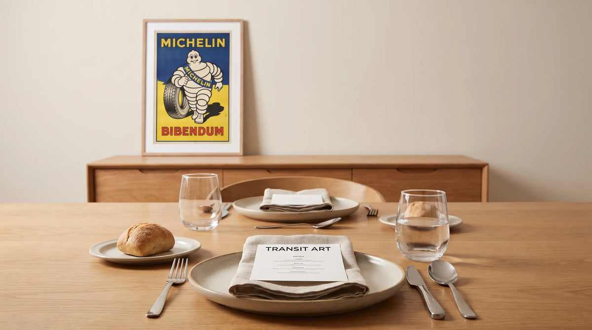
Michelin’s Bibendum is a good example of a character with a recognizable outline. Introduced in 1898, he took shape in artwork by Marius Rossillon, known as O’Galop. His tire-built body connects the illustration directly to motoring history, while his expressive personality gives it appeal beyond an enthusiast’s garage.
For poster prints viewed across a room, that combination offers something valuable: a subject with both a graphic identity and a story. Automotive enthusiasts may appreciate the connection to early motoring culture, while design lovers may be drawn to the advertising illustration itself.
The Michelin Bibendum Vintage X shows Bibendum at a dinner table against a white and blue background, with black and red French text. It is offered as a giclée print on 200 gsm paper. The dining scene makes it particularly relevant to a breakfast nook or dining area without losing its automotive connection.
Assess the balance of the pale character, blue background and darker lettering in the product image. You may want the figure to register first, or prefer the overall arrangement of colors and type. Either can work, provided you like what remains visible from your normal viewing position.

Control reflections before chasing finer detail
An attractive composition can lose impact behind a strong reflection. Check what the glazing would face: a window, a pendant light or a bright lamp may obscure the image from the place you sit.
Before hanging, hold a glazed frame near the proposed position and inspect it from several angles. Use a frame you already own if necessary. This will not reproduce every glazing option, but it can reveal an obvious reflection problem.
Ask your framer about the differences between standard glazing, reflection-control finishes and UV-filtering options. These terms describe different properties; do not assume that reducing reflections also provides a particular level of UV protection.
Paper weight is a separate consideration. The Michelin print’s stated 200 gsm describes its mass per unit area, not its surface finish, resistance to fading or the appearance of glazing placed over it. Likewise, “giclée” alone does not establish every aspect of long-term durability. Check specific product and framing information when those qualities matter to your room.
Make the artwork belong in your interior
Poster prints usually feel more integrated when their colors have a relationship with the room, but that does not require matching every shade. Repeat one supporting color and let the artwork introduce the rest.
With the Michelin illustration, a blue textile or a small red accessory could establish that connection. Keep those echoes modest so the room does not become a collection of matching objects. The dinner-table subject can supply the thematic link on its own.
In a restrained interior, consider a simple frame that does not compete with the lettering. Against a patterned wall, test whether a plain mat gives the image enough separation. A wider mat increases the display’s footprint but does not enlarge the illustration, so return to your distance check before deciding.
The guide to choosing mat borders for paper posters covers border proportions and materials in more detail. For rooms with stronger palettes, these ideas for choosing artwork for a colorful dining room offer further context.
Run a three-position test before ordering
A useful final check for poster prints is to assess the proposed display from three positions: the doorway, your usual seat and close to the wall. Each reveals a different issue.
- From the doorway: Check whether the composition has a clear presence without overwhelming the furniture.
- From your usual seat: Look for a recognizable subject, a pleasing balance of color and manageable reflections.
- From nearby: Consider the illustration’s details, the paper specification and how the mat or frame will meet the sheet.
If the design works close up but disappears from your seat, consider a larger image area or a closer-viewing wall. If it dominates the doorway, try a smaller outer frame or a quieter placement. Changing location can solve the problem without changing the artwork you love.
Frequently asked questions
Do poster prints have to be large to look good across a room? No. A smaller image with a clear silhouette and strong tonal separation can remain recognizable. Size still matters, but intricate detail generally needs either a larger display or a closer viewing position.
Should every word on an illustrated poster be readable? Not necessarily. Lettering can contribute rhythm, color and historical character even when you cannot read the smallest lines. If the wording is your main reason for choosing the piece, test its legibility more carefully.
Will a wider mat make the artwork easier to see? It can separate the image from a busy wall, but it does not make the printed subject larger. Compare the image dimensions as well as the finished frame dimensions.
Is heavier paper always better? No. Paper weight is only one specification. Surface, printing quality, handling and framing also affect the finished result.
Choose for the room, then enjoy the details
Start with the view you will live with every day. Measure the finished display, check the composition from a distance and account for reflections before choosing the frame.
For someone drawn to automotive history and vintage illustration, Michelin Bibendum Vintage X offers a subject that connects personal interest with domestic life. The right placement lets that character contribute to the whole room, while the dinner-table details reward a closer look.