Contemporary Prints That Complete a Neutral Living Room
Neutral living rooms are intentionally quiet, but they still need a point of view. The right contemporary prints add shape, movement and personal meaning without overwhelming a soft palette of white, cream, taupe, gray or natural wood. For anyone who loves travel, aviation history or transit inspired design, vintage airline artwork can bring just enough color and narrative to make a neutral room feel complete.
A neutral space can look elegant, but it can also drift into feeling unfinished if every surface is pale and every texture is subtle. Wall art solves that problem because it gives the eye somewhere to land. Instead of adding visual clutter, a well chosen poster introduces rhythm, proportion and a story that makes the room feel lived in.
The quiet power of transit inspired wall art
Transit art works especially well in restrained interiors because the subject already carries motion. Aircraft, route maps, skylines and travel typography all suggest distance and possibility, even when the color palette is controlled. That sense of movement helps a calm living room avoid feeling static.
Aviation posters have a particular advantage. They often combine strong graphic composition with romantic travel imagery, which means they can feel both nostalgic and modern. A plane crossing a vast sky, a city name set in confident lettering or a map filled with regional landmarks can create visual energy without needing loud decorative objects.
This is where neutral interiors benefit from a little contrast. A beige sofa, linen curtains and pale oak flooring can frame a poster beautifully, especially when the artwork includes red, blue, black or warm cream tones. The result is not a themed room. It is a balanced room with a clear focal point.
How contemporary prints complete a neutral living room
When choosing art for a pared back space, the goal is not to make the walls busy. The goal is to choose one or two pieces that sharpen the atmosphere of the room. Contemporary prints are ideal for this because they can bridge modern interiors and vintage subject matter, especially when the artwork has clean lines, bold typography or a strong central image.
Start with the feeling you want the room to have. A living room designed for reading and relaxed conversation may need softer colors, generous matting and a slim frame. A room built around entertaining can handle a stronger graphic poster above the sofa or sideboard. If your furniture is simple, the artwork can be more expressive.
Scale matters as much as color. A small print floating alone above a large sofa can look timid, while an oversized piece can make a modest room feel cramped. As a simple rule, artwork above a sofa usually looks best when it spans roughly one half to two thirds of the sofa width. That proportion gives the wall confidence without making the print feel oversized.
Why aviation posters suit calm modern interiors
The golden age of airline poster design gave us a visual language built around clarity. Airlines needed to sell destinations quickly, so the artwork relied on strong silhouettes, memorable place names and carefully controlled color. Those qualities still feel fresh in modern homes.
The Air France North America Associated Companies Travel Poster, illustrated by Plaquet in 1951, is a useful example. Its central 3D-effect map of North America turns geography into a decorative object, while the continent is filled with iconic imagery connected to travel and place. In a neutral living room, that kind of map based composition can add structure and conversation without feeling visually heavy.
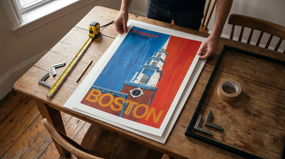
The Boston design takes a different approach. The Boston - American Airlines Poster uses a bold red and blue palette with the Boston skyline and a prominent church steeple. Its large city text gives the composition a confident architectural quality, making it especially effective above a console table, reading chair or compact sofa.
For a more dramatic sense of flight, the Air France 'Vers Des Ciels Nouveaux' Vintage Poster (Percival) captures the optimism of early air travel. The French phrase means towards new skies, and the artwork brings a romantic, high altitude feeling that pairs beautifully with cream walls, charcoal accents and warm wood furniture. Contemporary prints with this kind of heritage can make a neutral space feel cultured rather than empty.

Interior design ideas for styling aviation art
In a neutral scheme, contemporary prints work best when the surrounding materials give them room to breathe. Choose frames that support the artwork rather than compete with it. Black frames add definition, oak frames warm the room and white frames keep the look gallery like and soft.
Matting can also change the mood of a poster. A wide white mat creates a calm museum feel, especially around a colorful travel print. A narrow mat or no mat feels more graphic and modern. If the poster already has strong borders or typography, a simple frame may be enough.
Think about the colors already present in your living room. A Boston poster with red and blue can connect to navy cushions, a burgundy book spine or a small ceramic object on a shelf. An Air France piece with warm map tones may work well with rattan, brass, walnut or camel leather. The match does not need to be exact. Repeating one color in two or three places is usually enough.
| Design goal | Best artwork approach | Why it works |
|---|---|---|
| Add a focal point | One large aviation poster above the sofa | Creates visual authority in a quiet room |
| Build depth | Two related travel prints side by side | Adds rhythm without cluttering the wall |
| Warm up cool neutrals | Prints with cream, red, blue or ochre accents | Prevents gray or white rooms from feeling flat |
| Create a collected look | Mix airline art with vessel or city prints | Suggests travel history and personal taste |
Recommended Poster Pairings
A successful gallery wall feels intentional, not random. The easiest way to achieve that is to repeat a theme, a color family or a design era. For a neutral living room, contemporary prints should share enough visual language to belong together while still giving each piece room to stand on its own.
For an aviation focused arrangement, pair the Boston American Airlines design with the Air France North America map poster. One is city specific and architectural, the other is expansive and cartographic. Together they create a travel story that moves from destination to continent, which works especially well above a long sofa or along a hallway leading into the living room.
Add the Percival Air France poster when you want a stronger sense of romance and height. Its early aviation mood contrasts nicely with the clean typography of the Boston print and the illustrated map structure of the Plaquet poster. This three piece combination suits a living room with mid-century furniture, Scandinavian decor or a minimalist layout that needs personality.
If you want to broaden the wall beyond aviation, a vessel print can add another layer of transit history. The S/S Saltsjön vintage vessel print introduces a maritime subject while staying within the broader world of transport inspired art. It can sit comfortably near airline posters in a reading corner, especially if the room uses natural textures such as linen, jute, oak or wool.
Choosing the right layout for a neutral living room
Before hanging anything, mark the wall with painter tape or paper cutouts. This helps you judge scale from across the room. Art often looks larger when held in your hands and smaller once it is placed on a wall, so testing the layout prevents awkward spacing.
For a single statement print, center it at eye level or align it with the furniture below. Above a sofa, leave enough breathing room between the top of the sofa and the bottom of the frame so the art feels connected but not cramped. For a gallery wall, keep spacing consistent. Two to three inches between frames usually feels polished in a living room setting.
Contemporary prints also benefit from negative space. A neutral room does not need every wall filled. One considered artwork can be more powerful than five unrelated pieces. If you already have open shelving, sculptural lamps or patterned textiles, choose a calmer poster composition. If the room is very minimal, a stronger aviation print can carry the decorative weight.
Materials and finish matter
A print is not only about the image. Paper, finish and presentation affect how the artwork feels in the room. Transit Art focuses on gallery-quality poster finishes and FSC-certified paper printing, which suits buyers who care about both visual impact and materials. In a living room, that quality is noticeable because the artwork becomes part of the daily environment rather than a temporary decoration.
The finish should also match the mood of the room. Neutral interiors usually respond well to artwork that feels crisp but not overly glossy. A refined print surface helps colors stay rich while allowing the design to sit naturally beside fabric, wood and stone.
Frequently Asked Questions
Can contemporary prints work in a very traditional living room? Yes. Choose travel posters with classic typography, architectural subjects or muted color accents. A simple frame can help the artwork feel integrated with traditional furniture.
How many prints should I hang in a neutral living room? One large print is enough for a strong focal point. If you prefer a gallery wall, two to four related pieces usually feel curated without making the room busy.
Should aviation posters match my furniture colors exactly? No. It is better to echo one or two colors from the artwork in small details such as cushions, books or ceramics. Exact matching can make a room feel forced.
Where should I place travel posters in a living room? Strong locations include above a sofa, over a console, beside a reading chair or on a wall visible from the entry. Choose the spot where the artwork can be seen without competing with the television.
Final thoughts
Neutral interiors need more than quiet colors. They need contrast, memory and a sense of personal taste. Aviation inspired contemporary prints offer all three, combining graphic design, travel history and a timeless feeling of movement. Whether you prefer the urban confidence of Boston, the map based storytelling of Air France or the romantic pull of new skies, the right print can turn a calm living room into a space with character.