How Prints on Paper Create a Gallery-Quality Look
Prints on paper have a quiet power that suits both serious collectors and people simply trying to make a room feel more personal. A well chosen print can bring movement, nostalgia and visual rhythm to a wall without overwhelming the interior. For transport enthusiasts, paper is especially fitting: it recalls vintage race programs, railway posters, travel advertisements and the printed ephemera that shaped automotive culture long before digital screens entered the picture.
The gallery-quality look does not come from the artwork alone. It comes from the relationship between subject, paper surface, framing, scale and placement. A racing poster in a good frame can feel as considered as a museum display, while a small print in the wrong spot can disappear. The goal is to make the artwork feel intentional, not merely decorative.
Why prints on paper create a gallery-quality look
Paper brings detail, texture and warmth
The appeal of prints on paper starts with the way paper handles detail. Compared with slicker materials, paper has a tactile softness that helps color sit beautifully in a room. Matte and fine art style finishes can reduce glare, making illustrations, typography and subtle background tones easier to appreciate from different angles.
This matters for vehicle art because automotive and transit imagery often relies on fine lines, period lettering, badge details and motion cues. A paper print can preserve that graphic clarity while still feeling warm enough for a living space. It avoids the overly glossy look that can make a room feel more commercial than personal.
Paper also creates a natural bridge between art history and modern interiors. Many of the most memorable travel and motorsport images of the 20th century were originally designed as posters, not as objects on metal or acrylic. Displaying vehicle art on paper respects that lineage while making it practical for contemporary homes.
The frame turns a poster into a focal point
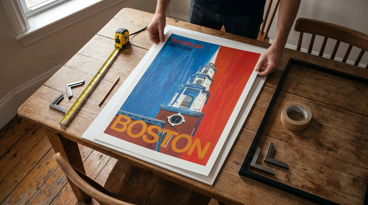
A print becomes gallery-like when it is treated as an object worth viewing. That usually means a frame with clean proportions, enough breathing room around the image and a placement that gives the eye space to rest. The same artwork can feel casual when pinned to a wall or refined when mounted behind glazing with a considered frame.
For prints on paper, framing is part protection and part presentation. A slim black frame can sharpen a racing poster with bold typography. Natural oak can soften vintage artwork and work beautifully in Scandinavian interiors. A white frame can make colorful subjects feel lighter in bedrooms, hallways or compact apartments.
| Frame choice | Best suited to | Visual effect |
|---|---|---|
| Black frame | Racing posters, bold typography, high contrast art | Crisp, graphic and architectural |
| Natural wood frame | Vintage vehicles, boats, warm color palettes | Relaxed, warm and timeless |
| White frame | Minimal rooms, smaller spaces, colorful prints | Clean, airy and understated |
| Thin metal frame | Modern interiors, monochrome art, industrial rooms | Sleek, precise and contemporary |
Racing heritage on paper: two artworks with real energy
1950 BMW Race Victory Poster
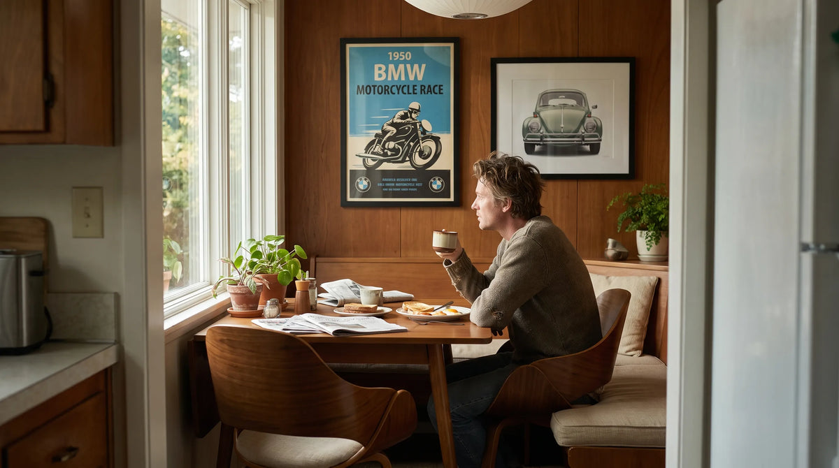
The 1950 BMW Race Victory Poster draws from a powerful chapter in postwar motorsport culture. It celebrates BMW's triumph at the 4th German Championship, "Rund um Schotten," with a motorcycle charging toward the finish and the BMW logo set against a checkered flag. The composition is direct, fast and celebratory, exactly the kind of visual language that made racing posters so compelling in the first place.
This type of artwork appeals to motorcycle enthusiasts, BMW followers and collectors who appreciate the period when motorsport promotion depended on strong graphics rather than photography alone. The motorcycle is not just a vehicle in the image. It becomes a symbol of engineering confidence, competitive spirit and national racing tradition.
As prints on paper, vintage race images like this retain the feeling of a historic event notice. That is part of their charm. They look at home in a study, garage lounge, hallway or reading corner because they carry both story and design value.
1963 24 Heures du Mans Swirling Speed Poster
The 1963 24 Heures du Mans Swirling Speed Poster takes a different approach. A bright red racing car marked with number 24 cuts through a swirling, clocklike track, surrounded by painterly golden tones and bold typography. The image captures the central drama of endurance racing: speed measured against time.
Le Mans has been associated with mechanical endurance, driver stamina and technical ambition since the early 20th century. A poster inspired by the 24-hour race does not need to show every detail of a car to feel powerful. The sense of rotation, time pressure and color contrast does the work. The result feels nostalgic but energetic, making it especially suitable for rooms that need movement.
For collectors who enjoy prints on paper, Le Mans artwork offers a strong balance between motorsport history and graphic sophistication. It can sit comfortably beside mid-century furniture, industrial lighting or a clean modern desk setup without feeling like a simple fan item.
Interior design ideas for paper wall art
Choosing the right scale for the room
Scale is one of the biggest differences between a wall that looks finished and one that feels unfinished. A single small poster above a large sofa can look isolated. A larger framed print or a group of coordinated pieces creates visual weight and makes the artwork feel planned.
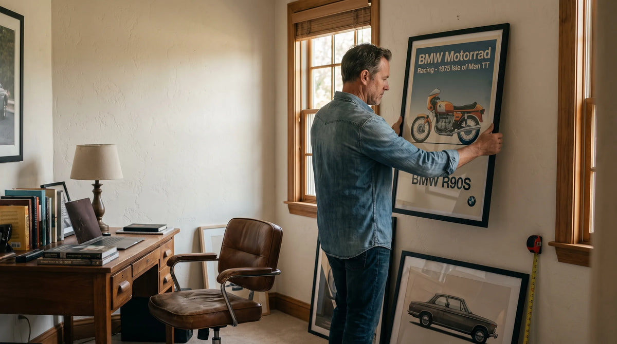
In living rooms, place the center of the artwork near eye level and relate the print width to the furniture below it. Above a sofa, a framed piece or grouping often works best when it feels visually connected to the seating area rather than floating too high. In a home office, a vertical poster can add height beside a bookshelf, while a horizontal piece can anchor the wall behind a desk.
Prints on paper are flexible because they can be framed, grouped, rotated seasonally and adapted to different rooms. That makes them useful for renters and homeowners alike, particularly when building a collection over time.
Matching color, subject and mood
Vehicle art can be bold, but it does not have to dominate a room. The trick is to repeat at least one color or material from the print elsewhere in the space. A red racing car can connect with a burgundy chair, a small lacquered tray or warm-toned books. A golden Le Mans background can echo brass lighting, wood furniture or tan leather.
For minimalist interiors, choose one strong piece and leave negative space around it. For eclectic rooms, combine racing, maritime and urban transport art to create a layered story. Transit Art's wider catalog makes that approach easy to imagine, from road racing imagery to historic vessel prints such as the S/S Norrskär premium giclée print.

Recommended Poster Pairings
A gallery wall works best when the pieces share a visual thread. That thread might be subject matter, era, color, typography or motion. For automotive and transit interiors, prints on paper can be combined in a way that feels curated rather than crowded.
| Poster pairing | Why it works | Ideal placement |
|---|---|---|
| 1950 BMW Race Victory Poster | The motorcycle racing subject, checkered flag motif and vintage competition mood make it a strong anchor for motorsport walls. | Home office, garage lounge or hallway |
| 1963 24 Heures du Mans Swirling Speed Poster | The red car, circular motion and golden tones add energy beside the BMW poster without repeating the same composition. | Living room, media room or studio |
| Le Grand Sport Amilcar Vintage Poster | A classic French motoring feel can add elegance and historic depth to a racing themed arrangement. | Reading nook, library wall or dining area |
| Citroen Wreck art print | A more weathered automotive subject brings contrast, making the gallery wall feel less polished and more story driven. | Industrial loft, workshop wall or creative studio |
When combining these pieces, keep the frames consistent if you want a refined gallery effect. If the room is more relaxed, use two frame finishes at most, such as black and natural wood. The goal is to let the subject matter vary while the presentation ties everything together.
How to care for and display prints on paper
Good care helps prints on paper maintain their color, surface and crispness over time. Avoid hanging artwork in direct sunlight, especially near large windows where UV exposure and heat can affect paper and inks. If the print will sit in a bright room, consider glazing with UV protection through a professional framer.
Humidity is another factor. Bathrooms, damp basements and poorly ventilated rooms are rarely ideal for paper artwork. A hallway, living room, office or bedroom is usually safer. If you are storing prints before framing, keep them flat or carefully rolled in suitable packaging, away from moisture and heavy objects.
Matting can also improve presentation. A mat creates distance between the print and glazing while giving the image visual breathing room. For vintage-inspired automotive posters, an off-white mat can feel softer than a stark white one. For high contrast modern rooms, no mat and a slim black frame can look more direct.
Transit Art prints are made with gallery-quality materials and FSC-certified paper, which supports a refined finish and a more considered material choice. That foundation matters, but the final effect still depends on how the print is framed, positioned and paired with the rest of the room.
Frequently Asked Questions
Are prints on paper good for a gallery wall? Yes. They are lightweight, versatile and easy to coordinate by theme, color or frame style. Vehicle posters are especially effective because racing, railway, maritime and aviation subjects naturally create movement across a wall.
Should automotive posters be framed with or without a mat? Both can work. A mat creates a more classic gallery look, while a no-mat frame feels sharper and more contemporary. Vintage racing posters often look excellent with a narrow mat in off-white or warm white.
Where should I hang racing posters at home? Racing posters work well in home offices, lounges, hallways, media rooms and creative studios. For a living room, use one large framed poster as a focal point or group two to four pieces in a balanced arrangement.
How do I make paper posters look more premium? Choose artwork with strong composition, use a quality frame, avoid direct sunlight and hang the piece at a considered height. A consistent frame style across several prints will instantly make the display feel more curated.
Bringing a gallery-quality atmosphere home
The reason prints on paper remain so effective is simple: they combine accessibility with artistic presence. A great poster can carry history, emotion and design intelligence into a room without demanding a complete interior redesign. For transport enthusiasts, the right print also turns personal passion into something visually sophisticated.
A BMW motorcycle victory scene, a swirling Le Mans endurance composition or a weathered Citroen study can each change the mood of a room in a different way. Start with the story you want the space to tell, then choose the artwork, frame and placement that support it. When those details work together, paper wall art becomes more than decoration. It becomes part of the architecture of the room.
For anyone building an automotive or transit-inspired interior, Transit Art offers a focused way to explore vehicles, movement and design through collectible wall art that feels at home in modern spaces.