Article: How to Choose Prints of Car Drawings for a Reading Corner
How to Choose Prints of Car Drawings for a Reading Corner
If you are searching for “drawings prints” to finish a reading corner, start with the atmosphere you want beside your favorite chair. A car drawing can bring mechanical detail, personal memories and beautiful proportions into a small space without making it feel like a showroom. The most successful choice is not necessarily the rarest vehicle or the largest print. It is the artwork you enjoy studying, framed and positioned so it belongs with your books, lighting and furniture.
Here is how to choose a car-led arrangement that feels restful, with two vintage motorcycle posters worth considering if your interests extend across motoring history.
Start with the story behind the car
A recognizable silhouette gives automotive art its immediate appeal, but the story behind that shape gives it staying power. Think about whether your interest lies in engineering, racing, coachwork or a personal connection to a particular vehicle.
The Porsche 911, introduced in 1963, appeals partly through the continuity of its distinctive profile. The Ford Mustang, introduced in 1964, carries a different association with accessible performance and American popular culture. Neither needs a dramatic racing scene to make an engaging subject. A carefully observed drawing can let the bodywork do the talking.
These are examples of how to choose a subject, rather than claims about particular prints in stock. Before choosing any vehicle artwork, check that the model, generation and body style match what you actually admire. Enthusiasts notice those distinctions.
For a reading corner, prints of car drawings often work best when their appeal extends beyond the badge: an elegant roofline, expressive wheels or the relationship between the vehicle and the empty space around it.
How to assess “drawings prints” for a reading corner
Choose a level of detail that suits the viewing distance
A delicate pencil study invites close inspection. A simplified outline remains readable across the room. A technical drawing rewards an interest in construction, but dense annotations can compete visually with nearby book spines.
Picture the artwork from two positions: standing at the entrance and sitting in the chair. If the car disappears into fine lines from the doorway, that may be perfectly acceptable for an intimate corner. If you want the print to define the whole area, choose a stronger silhouette or clearer contrast.
Separate the image from the print specification
“Drawing” describes how an image looks or was created. “Print” describes the physical reproduction you display. A vintage-looking illustration is not necessarily an original period object, and a detailed image does not automatically guarantee a well-produced print.
Transit Art describes its posters as having a gallery-quality finish and being printed on FSC-certified paper. Check the individual listing for available dimensions and what is included. Do not assume a frame, mount or particular conservation specification comes with the artwork.
The guide to creating a gallery-quality look with prints on paper offers useful context for choosing the presentation as carefully as the image.
Fit the artwork to the chair, wall and light
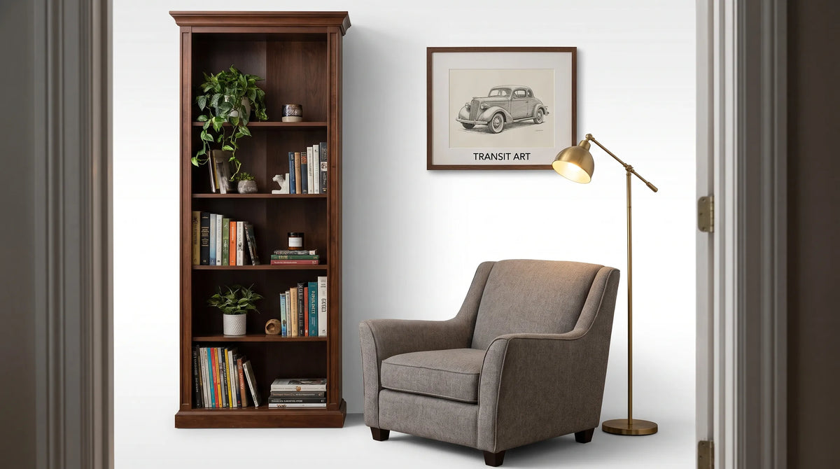
Treat the reading corner as a small composition: chair, lamp, side table and artwork. The print should relate to that grouping rather than automatically being centered on the entire wall.
Before ordering, mark the proposed outer frame dimensions with removable paper templates. Include the mount and frame in your measurements, not just the printed image. Then sit down, switch on the reading lamp and check whether the arrangement still feels comfortable.
| Reading-corner layout | Arrangement to test | What to check |
|---|---|---|
| Armchair against a narrow wall | One portrait-format print beside or above the chair | The frame clears the chair back and nearby switches |
| Low chair beside a bookcase | One landscape-format drawing on the adjacent wall | Shelves do not crowd the composition |
| Reading bench in a larger room | Two coordinated prints in a horizontal grouping | The pair reads as one arrangement from across the room |
| Corner with little wall space | A small framed print on a stable shelf | Books, lamp fittings and movement will not knock it over |
For prints of car drawings, use the direction of the vehicle as a compositional tool. A car facing toward the chair can help connect the picture to the seating area. Treat that as a useful experiment, not a rule that overrides your favorite image.
Position the lamp primarily for reading. If its bulb reflects in the glazing from your seated position, adjust the lamp or artwork before considering a different frame. Keep paper artwork away from persistent direct sunlight and damp locations.
Build a quiet palette around the drawing
Black-and-white car art is an easy starting point, but it is not the only calm option. Muted blue, tobacco brown, soft gray or warm cream can work beautifully when those colors already appear in upholstery, wood or book covers.
Choose one element to repeat. A black frame might echo a metal reading lamp; a pale timber frame might connect with an oak side table. The drawing does not need to match every accessory. Too much coordination can make a personal collection feel staged.
If the shelves are colorful and densely packed, give the artwork more breathing room. A generous mount or an uncluttered wall can keep fine automotive linework readable. In a spare room, a more detailed drawing may provide the visual richness that the furniture lacks.
When choosing prints of car drawings for a shared home, agree on the palette and visual intensity before debating the vehicle. Transit Art’s advice on choosing wall art when your tastes differ is useful when one person loves machinery and the other prefers quieter interiors.
Recommended Poster Pairings
A car drawing does not need a companion. However, readers who collect books about transport, industrial design or early motorsport may enjoy a broader motoring theme. These two Transit Art motorcycle posters offer that connection. They are vintage advertisements, not car drawings, so choose them as deliberate supporting pieces rather than interchangeable substitutes.

1930 Norton Motorcycle “Unapproachable” Advertisement Poster
The 1930 Norton Motorcycle “Unapproachable” Advertisement Poster combines a classic black-and-white motorcycle image with an emphatic advertising tagline. Its emphasis on the machine’s lines makes it a natural companion to a monochrome car study.
Norton was founded in Birmingham in 1898, and its identity became closely associated with British motorcycling and competition. This advertisement offers a glimpse of how that identity was presented to buyers: the engineering is both the product and the visual attraction.
For someone who enjoys mechanical design as much as a particular car marque, the connection feels coherent. Try the Norton poster on a short return wall beside the bookcase, with the car drawing remaining the main image above the chair. Matching frame finishes can unite the pair without requiring identical layouts.
1930s BMW Motorcycle Advertisement Poster
The 1930s BMW Motorcycle Advertisement Poster features the headline “Motor und Sport” and a rider on a BMW 750cc motorcycle. The rider introduces a human presence, offering a contrast to an isolated car profile or mechanical study.
BMW’s motorcycle history predates its production-car history. Its first motorcycle, the R32, appeared in 1923, making a 1930s motorcycle advertisement relevant to a collection exploring the brand’s early engineering identity. That context does not identify the motorcycle in this poster as an R32; the listing describes a 750cc machine.
Pair it with the Norton poster if you want a small grouping about interwar motorcycling, or place it near a car drawing to broaden the subject to European motoring culture. Compare the actual product images before ordering, especially their background tones and typography. In a reading corner, an adjacent wall often gives a bold advertisement room to breathe without competing directly with the main artwork.
Check the pairing before committing to frames
The strongest combination of prints of car drawings and vintage advertisements usually shares one clear feature: similar tonal contrast, a related historical period or a common emphasis on engineering. It does not need to share all three.
Use the actual product images to compare the balance of lettering and illustration. Two headline-heavy advertisements may feel lively together, while one advertisement beside a quieter drawing creates a different rhythm. If you are considering the Norton and BMW posters as a pair, let their shared period and motorcycle subject provide the connection rather than assuming their colors are identical.
Choose sizes only after testing the whole arrangement. Different proportions can work with consistent framing, but each piece still needs enough surrounding wall to be seen clearly.
Frequently Asked Questions
Are car drawings suitable for a small reading corner? Yes. A single drawing with a clear silhouette can add character without needing a large display. Test the framed dimensions with a paper template so the artwork does not crowd the chair, lamp or shelves.
Can car and motorcycle artwork work together? Yes, when there is a clear connection such as period, engineering interest or visual treatment. Keep one piece dominant if the corner is small, and remember that a text-heavy advertisement will read differently from a line drawing.
Should every frame match? No. Matching finishes are an easy way to unify different images, but coordinated frames can also work. Compare their visual weight and keep the overall arrangement simpler when the nearby bookshelves are busy.
Choose artwork you will enjoy looking at slowly
The best reading-corner artwork holds your interest without demanding constant attention. Start with a car or design detail that means something to you, then check scale, light and framing from the chair where you will actually sit.
As you explore Transit Art’s transport-inspired artwork, let that personal connection guide the choice. One well-placed drawing, or a considered pairing rooted in motoring history, can make the corner feel distinctly yours.