Artikel: How to Curate an Art Collection Around Transit Design
How to Curate an Art Collection Around Transit Design
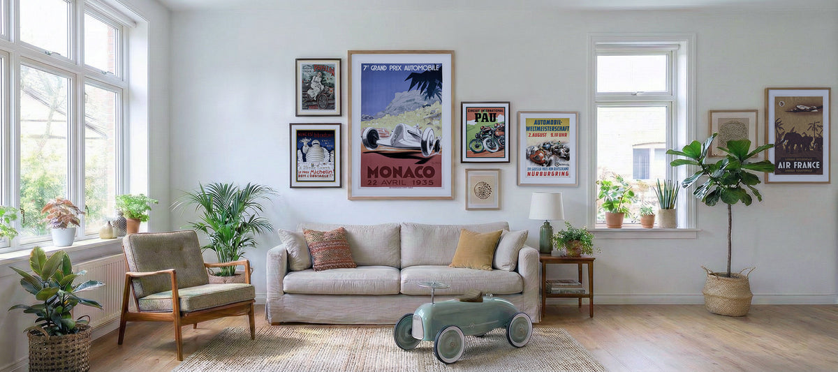
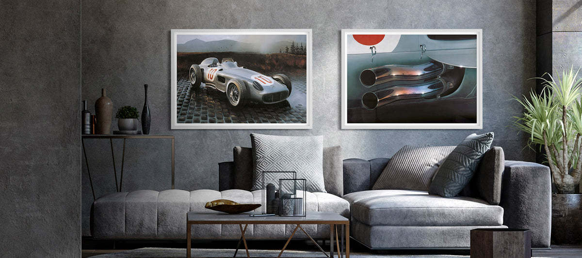
A transit-inspired art collection can do more than fill a blank wall. It can give a room rhythm, memory and a sense of movement without feeling like themed decor. The best collections usually start with one clear idea, such as ocean liners, road racing, aviation, rail travel or the graphic language of vintage posters. From there, you can build with intention, choosing pieces that share a mood, palette or story. Transit design works especially well in modern interiors because it combines engineering with romance. A car silhouette, a ship funnel, a fighter jet, a railway route or a bicycle frame can read as design, history and personal identity at the same time. The goal is not to buy every print you like. The goal is to create a wall that feels collected, edited and lived with.
Start Your Art Collection With a Clear Transit Point of View
Transit design is a broad world, so a strong collection needs a boundary. That boundary does not have to be rigid, but it should help you say yes or no when you are choosing new pieces. Without it, a wall of vehicle art can quickly turn into a group of unrelated posters.
Start by choosing your collecting lane. It could be a mode of transport, a period, a destination style or even a feeling. Some collectors respond to speed and machinery. Others prefer the glamour of passenger ships, the optimism of aviation or the graphic confidence of railway advertising.
| Collecting direction | Visual mood | Strong subjects | Best room fit |
|---|---|---|---|
| Aviation | Dramatic, technical, atmospheric | Aircraft, runways, airfields | Office, den, hallway |
| Maritime travel | Elegant, nostalgic, destination-led | Ocean liners, coastal vessels, harbors | Living room, dining room |
| Automotive culture | Energetic, sculptural, personal | Sports cars, rally scenes, classic models | Garage lounge, study, media room |
| Rail and urban transit | Graphic, structured, architectural | Trains, stations, maps, platforms | Entryway, home office |
This one decision keeps your art collection cohesive even when the subjects vary. A wall can include a plane, a ship and a car if they share the same design language, but it will feel scattered if every piece tells a completely different visual story.
Choose a Visual Thread Before You Buy
Once you know your point of view, look for a visual thread. This is the element that makes separate artworks feel related from across the room. It might be color, era, composition, typography or line quality.
A room with warm woods and leather can handle sepia tones, cream paper, muted reds and deep blues. A white modern apartment may work better with crisp graphic shapes, strong black outlines and generous negative space. If you prefer a layered, collected look, mix both vintage and contemporary transit prints, but keep one or two constants in place.
In a transit art collection, repetition matters more than matching. For example, three different vehicle types can work together if each print includes diagonal movement, a limited palette or a strong central silhouette. This lets the collection feel curated rather than uniform.
Use color like a route map
Color is often the easiest way to connect pieces. Pick a dominant family, then use accents sparingly. Navy, cream and red suit maritime and railway themes. Charcoal, silver and stormy blue work beautifully for aviation. Ochre, forest green and black can make vintage motoring feel rich without overpowering a room.
Try not to choose every print at maximum intensity. A collection needs quieter pieces too. They give the eye a place to rest and make the dramatic works feel more important.
Balance Iconic Subjects With Unexpected Finds
A good transit wall needs both recognizable anchors and quieter discoveries. The anchor piece is the print that sets the tone. It might be large, high contrast, historically specific or emotionally personal. Around it, you can place supporting pieces that add texture and depth.
For aviation collectors, Viggen during landing is a strong example of an atmospheric anchor. The scene shows the SAAB fighter jet Viggen landing on a Swedish road base in bad weather, based on an original oil painting from 1968 and available as a Giclée print on 200 gsm museum-quality matte paper in three sizes. Its mood is technical, cinematic and grounded in a specific aviation culture.
For maritime and travel lovers, Canada by the Cunard Line Poster brings a different kind of presence. The maple leaf framing, ocean liner silhouette and bold travel-poster language make it useful for a collection centered on ocean crossings, national identity or vintage tourism. A strong art collection often gains character from this kind of contrast, where one piece feels stormy and mechanical while another feels graphic and aspirational.
Let secondary prints expand the story
Supporting works should not compete with the anchor. They should add context. If you are building around maritime history, a coastal vessel print such as S/S Express ll can add a quieter, regional note beside a bolder ocean liner poster. If the room leans toward nighttime roads and modern automotive energy, Night Ride can bring a darker, cinematic counterpoint.
The same principle works in any category. One dramatic print, one graphic print and one quieter historical piece often create a more mature arrangement than three equally loud images.
Plan Scale, Spacing and Placement Like an Interior Designer
A framed print changes once it enters a room. Size, wall color, furniture height and lighting can make a piece feel either deliberate or misplaced. Before hanging anything, map the wall with painter's tape or paper templates.
Above a sofa, a group of prints often works best when the overall arrangement is roughly two-thirds the width of the furniture. In a hallway, a vertical stack can guide movement. In a home office, one strong print behind or beside the desk can create focus without visual noise. For a polished transit art collection, placement should echo how people move through the space.

Mix sizes without losing order
Transit art benefits from variety in scale because the subject matter often suggests motion. A large aircraft print can feel expansive, while smaller ship or car prints invite closer inspection. The trick is to create an invisible structure.
Use one of these simple layouts:
- A large anchor print centered with two smaller works beside it
- A grid of equal frames for a clean, gallery-style look
- A salon-style arrangement with consistent frame colors and varied sizes
- A vertical pair for narrow walls, stair landings or reading corners
Keep spacing consistent, usually 2 to 4 inches between frames for a compact grouping. Larger rooms can handle wider gaps, but too much space can make related prints feel disconnected.
Use Materials and Frames to Make the Collection Feel Permanent
The right print material and frame can make transit art feel less like a poster wall and more like a long-term collection. Transit Art prints are designed with a gallery-quality poster finish, and many works are printed on FSC-certified paper, which suits collectors who care about both presentation and responsible sourcing.
Frame choice should support the subject. Black metal or slim black wood can sharpen aviation and rail prints. Natural wood can soften maritime posters or vintage car scenes. White frames work best when the artwork has strong borders or a clean graphic style. For a refined art collection, avoid changing frame style with every print unless the room is intentionally eclectic.
Matting is another useful tool. A wide mat can give a smaller print more presence, especially in a hallway or office. It also helps vintage-style artwork breathe, which matters when typography and illustration are both important.
Think in finishes, not just images
Glossy surfaces can create glare in sunny rooms, especially near windows. Matte or uncoated papers generally feel calmer and more tactile, which is helpful for interiors that already include polished metal, glass or leather. Canvas wall art can work well when you want a softer object presence rather than a framed-paper look.
If you are mixing posters, canvas prints and smaller decor items, keep the main wall consistent and let mugs, mobile covers or other transit-inspired pieces live elsewhere in the room. That separation keeps the wall from feeling like a display shelf.
Edit Before You Hang, Then Edit Again
Curation is as much about subtraction as selection. Lay every piece on the floor before hanging. Remove anything that repeats the same idea without adding something new. If two posters have similar colors, similar vehicles and similar compositions, choose the stronger one or separate them into different rooms.
A well-edited art collection should answer three questions clearly. What is the subject? What is the mood? Why do these pieces belong together? If the answer depends only on all of them being vehicles, the theme needs tightening.
You can also create a small rotation system. Keep one or two prints stored safely and switch them seasonally. Maritime posters may feel especially natural in summer, while stormy aviation scenes or winter rally imagery can suit colder months. Rotation keeps the collection alive without forcing you to crowd every wall.
Leave room for future discoveries
One of the pleasures of collecting transit design is that the subject never really runs out. New interests appear as you learn more about aircraft, historic vessels, automotive forms or the visual language of travel advertising.
Leave physical space and conceptual space for the next piece. If your wall is already full, a future print has nowhere to land. A little restraint now makes later collecting more satisfying.
Common Mistakes to Avoid
The most common mistake is treating transit art as novelty decor. A car print or ship poster can be playful, but it still needs the same attention you would give to any other artwork. Scale, color, paper, framing and sightline all matter.
Another mistake is over-theming the room. If the wall features trains, the rug does not need tracks and the lamp does not need to look industrial. Let the artwork carry the theme, then support it with quieter furniture and materials.
Finally, do not ignore personal connection. The best transit art collection is not built from what looks impressive online. It is built from subjects that connect to memory, aspiration, design taste or curiosity. A print of an aircraft, a ship or a car becomes more meaningful when it reflects something you genuinely care about.
Frequently Asked Questions
How many pieces do I need to start a transit-themed collection? Three pieces are enough to create a clear direction. Start with one anchor print and two supporting works, then expand only when you find pieces that strengthen the theme.
Can I mix cars, planes, ships and trains on one wall? Yes, but use a shared visual thread such as color palette, era, frame style or graphic treatment. A mixed transit art collection feels intentional when the pieces relate beyond subject matter.
Should all prints be the same size? Not necessarily. Equal sizes create order, while mixed sizes create movement. If you mix sizes, keep frame style or spacing consistent so the arrangement still feels designed.
Are vintage-style posters only suited to traditional interiors? No. Vintage transit posters can work beautifully in modern interiors because their bold shapes and typography often feel clean and architectural.
Where should I place the strongest print? Place it where the eye naturally lands first, such as above a sofa, at the end of a hallway or near a desk. Give it enough space so it can act as the visual anchor.
Bring Movement Into Your Walls
Curating around transit design is about more than liking vehicles. It is about choosing images that carry speed, distance, craft and atmosphere into your home. Start with one clear point of view, choose a visual thread, balance statement pieces with quieter finds and use framing to make everything feel intentional.
If you are ready to build from that foundation, explore the vehicle-inspired prints, canvas wall art and transit-themed decor at Transit Art and choose pieces that feel connected to the way you want your home to move.