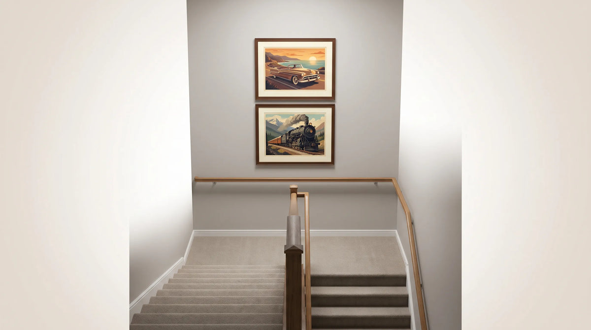
Artikel: How to Choose Decorative Posters for a Colorful Dining Room
How to Choose Decorative Posters for a Colorful Dining Room
How to Choose Decorative Posters for a Colorful Dining Room
Choosing decorative posters for a colorful dining room is less about finding another bright object and more about giving the room a point of focus. Between painted walls, upholstered chairs, patterned dishes and flowers, there may already be plenty happening. The right artwork connects those elements while adding something personal, whether that is a love of classic cars, memories of travel or an appreciation for everyday street scenes.
Start with the room’s colors, then consider the story, scale and placement of the artwork. That order makes choosing much easier.
Read the room’s existing color palette
Look at the dining room in daylight before browsing prints. Identify its largest areas of color: the walls, curtains, rug and chairs. Then notice the quieter surfaces, such as a wooden table or cream ceiling, that give your eyes somewhere to rest.
Your artwork does not need to match everything. Choose one of these approaches instead:
| What the room already has | What to look for in the artwork | Why it helps |
|---|---|---|
| Several saturated colors | One repeated room color with quieter surrounding tones | Connects the artwork without adding another competing palette |
| One dominant wall color | A contrasting accent balanced by neutral areas | Creates a distinct focal point |
| Patterned wallpaper or upholstery | A clear subject and an uncluttered composition | Keeps the wall readable from across the table |
| Bright chairs against pale walls | A print that echoes one chair color | Makes the furniture and artwork feel related |
Treat these as selection methods, not descriptions of any particular product. Compare the actual artwork with your room before committing. A small cushion, fabric swatch or paint sample is more useful than trying to remember a shade while shopping.
Choose decorative posters with a story
A dining room is a social space, so artwork with an engaging subject can offer more than color coordination. Transport scenes are especially useful when they combine a recognizable vehicle with a setting that invites a closer look.
A Studebaker scene with everyday character
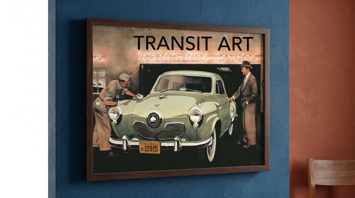
Transit Art’s Studebaker at Whalley Avenue depicts a classic Studebaker being picked up from a car wash. That everyday setting gives the automotive subject a human context: this is a car within a neighborhood routine, rather than an isolated machine.
The brand also has a substantial story behind it. Studebaker’s history began with wagon manufacturing in South Bend, Indiana, in 1852. The company later moved into automobiles, producing electric cars in 1902 and gasoline-powered cars in 1904. Its transition from horse-drawn transport to motoring makes the name interesting beyond any single model.
For an enthusiast, the appeal may be that manufacturing heritage. Someone less interested in cars might enjoy the street setting or the suggestion of an ordinary day from another period. A shared room benefits from artwork that offers more than one way to appreciate it.
Let the scene influence the room’s atmosphere without turning the dining area into a themed display. One automotive artwork can sit comfortably alongside contemporary furniture and colorful ceramics.
Size the artwork for the wall, not just the table
Before ordering decorative posters, measure the usable wall area and any furniture beneath it. A print that looks substantial in a close-up product image may feel small above a long sideboard.
As a starting exercise, try a framed width around half to two-thirds of the furniture below. For a 60-inch sideboard, that means testing a total framed width of roughly 30 to 40 inches. This is a decorating guideline, not a requirement or a statement about available product sizes.
Test the outline before choosing a format
Use low-tack painter’s tape, suitable for your wall finish, to mark the proposed outer frame dimensions. Include the mat border rather than measuring only the printed image. Leave the outline in place while you sit at the table and walk through the room.
Check whether the artwork feels connected to the furniture, whether a chair back interrupts the view and whether the frame crowds a doorway or curtain.
Dining rooms deserve a seated-view check. A position that looks balanced while standing may feel unnecessarily high during a meal. Above a sideboard, also leave enough room for serving dishes and lamps without letting those objects conceal the artwork.
Use frames and lighting to settle a colorful scheme
Frames give decorative posters a clear boundary, which is particularly helpful against strong paint colors or wallpaper. Think of the frame as part of the composition rather than an accessory added at the end.
Choose a frame that provides structure
A slim black frame can define the edge of an image in a busy room. Natural wood can connect it to a dining table, while a pale frame may create a gentler transition against a light wall. None of these choices requires every other frame or piece of furniture to match.
A mat adds breathing room between the artwork and its surroundings. Compare white, off-white and other restrained options against the actual print rather than assuming bright white is always best. Transit Art’s guide to choosing mat borders for paper posters explains the practical details, including opening measurements and conservation-safe materials.
Check the view after dark
Dining rooms often look quite different under evening lighting. Check whether a pendant reflects in the glazing from the main seats and whether the artwork remains visible when the room is dimmed.
Keep paper artwork away from direct sunlight where possible. UV-filtering glazing can reduce exposure, but it does not make a print immune to fading. In a dining area connected to a kitchen, distance from steam and cooking residue also matters.
Transit Art’s poster range includes FSC-certified paper and gallery-quality finishes. Check the chosen listing for its available sizes and format, then select framing appropriate to the space.

Know when one print is enough
A colorful dining room does not automatically need a gallery wall. If the chairs, wallpaper or tableware already introduce several patterns, one substantial artwork may provide a clearer focal point than a collection of smaller pieces.
The Studebaker scene can serve that role without requiring matching automotive objects throughout the room. Repeat a color from the actual artwork in a modest detail, perhaps napkins or a vase, and leave other surfaces relatively quiet.
When combining decorative posters, choose a shared visual quality before choosing additional subjects. Similar background tones, comparable detail levels or consistent frame finishes can bring different images together. A transport theme alone does not guarantee that two compositions will work side by side.
For a shared dining room, agree on the overall mood before discussing favorite vehicles. Transit Art’s advice on choosing wall art when your tastes differ offers a useful approach to finding that common ground.
Keep the wider collection personal, not repetitive
An interest in automotive design does not have to appear only on the wall. Smaller everyday objects can carry that interest without adding more competing elements to the dining room.
Transit Art’s Mercedes 300 SL at Workshop mobile cover features the classic Mercedes at a service station. The road-going 300 SL debuted in 1954, bringing racing-derived engineering into a car celebrated for its performance and elegance. It remains a compelling subject for people who appreciate the relationship between mechanical innovation and design.
The mobile cover and Studebaker artwork share an appealing idea: notable cars shown in everyday working settings. They can suit the same enthusiast without needing to be displayed together. Let the wall artwork shape the dining room and keep the smaller accessory as a personal detail elsewhere.
For a gift buyer, that distinction is useful. Wall art requires some knowledge of the recipient’s space, while a phone cover requires checking the correct device compatibility before ordering.
Frequently Asked Questions
Should decorative posters match the dining room walls? They do not need to match exactly. Repeating one existing color can create continuity, while a contrasting accent can establish a focal point. Compare the whole composition with the room, including its quieter areas.
Can automotive art work in a dining room that is not retro? Yes. A classic-car scene can add historical interest to contemporary furniture. Keep the surrounding choices restrained rather than repeating a vintage theme across every object.
Is one large print better than several small prints? It depends on the wall and the room’s existing detail. A single larger piece often works well when wallpaper, upholstery or tableware already supplies plenty of pattern. Test the outer frame dimensions before deciding.
How can I judge a print’s colors online? Use the product images as a guide rather than an exact color guarantee. Screen settings and room lighting affect appearance. Compare your shortlist with physical room samples and check any available product guidance before ordering.
Choose for the room and the people using it
The most successful decorative posters do two jobs: they bring visual order to the dining room and reflect something its occupants genuinely enjoy. Start with the palette, test the scale and check the evening view before making your choice.
For a household drawn to automotive history, the Studebaker scene offers a conversation-worthy subject without demanding a fully themed interior. Give it enough space to be appreciated, then let the table, the food and the company remain central.